How to develop your Brand’s Motion
The tools you can use to show your authenticity.
The tools you can use to show your authenticity.
by Andreja Mahović / 28 8 2020
Levels of branding are always exciting to explore and build on. With each of the layers added, your brand gains depth and value. When you figure out the visual identity of the brand and its aesthetics, it comes down to evolving its MOTION.

For OG’s TI performance, we always created special Aegis-inspired assets.
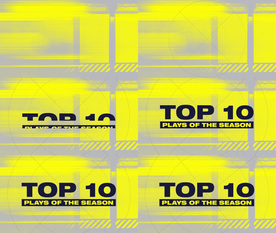
The topic is a wide one and a lot of assets can fall under its wing. The way I like to see it boils down to: whatever content you produce that moves in front of the eyes of the viewer, is a part of the MOTION branding. These assets can include everything from a 2D lower third for your videos to a 3D embodiment of the mascot of your brand for the brand launch video.

When I worked on my first branding project, I tried to implement everything I loved into it. I wanted to build a brand I personally loved. It worked out really well and the community loved it. When I started the next project, I immediately realised that I do not want to replicate things. But I also did not want to create something I don’t like or believe in. So the biggest question for me was – ‘How do I connect with the audience and get them to recognise how unique & authentic a brand can be?’. MOTION is the starting point in answering that.
NYXL’s assets always borrow the inspiration for the transitions which come out of the logo shape or it’s arrows.
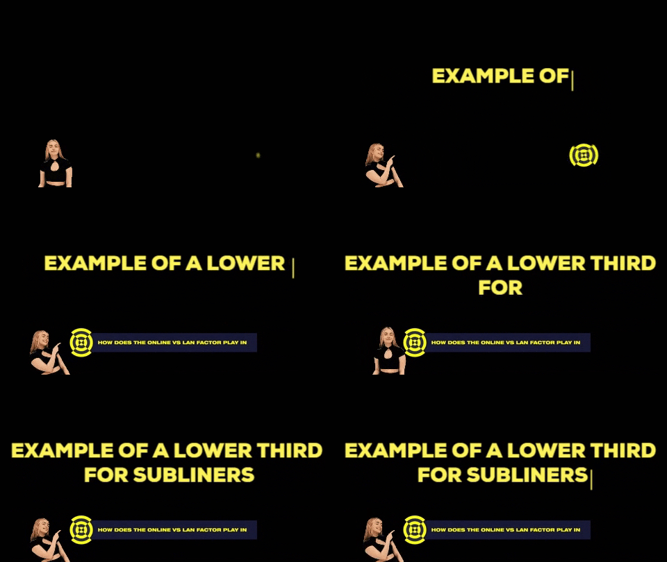
One of the mandatory assets to immediately consider are your video intro & outro. They can be (but don’t have to be) the same. Next in the line are lower thirds & transitions (both text & in between scenes). Together, all these assets form the most basic toolkit that your brand needs if you want it to live in the digital space.

There can be a lot of questions to answer, so it might get a bit overwhelming. I start with the simplest ones. What should move? How does it start moving? How does it transition? How does it end? You can apply this to every piece of content you are creating, regardless of purpose or complexity.
With Titans, we used the logo to literally crush the opponents in our motion assets.
You can also play around with different brand elements & assets to further evolve your MOTION content. In the video of an OG x Red Bull re-brand, we brought the logo outline to life. I had the idea of presenting this as the biggest milestone in OG’s then successful run. Since the team had won 4 majors at that point, and had a slump at The International, I figured that it would be cool to present each cornerstone of the logo’s shape as a milestone reached. All the pieces fell into the right place.
I was pretty lucky with this concept as it perfectly fit the team’s story and the logo’s shape.
The top corner represents the birth of the OG brand. The top right corner is the first big win, the Frankfurt Major. The shining particle which continues to draw the outline reaches another win in Manila, followed up by a TI slump. Funnily enough, this milestone fit the corner in the bottom of the logo. The follow up milestones are the Boston & Kiev wins and, as the particle approaches the starting point, it rounds up an outline of the old logo. This point marks the new beginning, the closure of a chapter, and makes the old logo complete. The re-brand is announced and we are ready for the new era of OG, the new beginning.
The motion elements can also be very subtle. You can draw an illustration which later on you can animate the elements of, give a 3D feel to it by animating different layers or simply create a parallax effect. You can also animate different characters, objects and other parts of the environment.
When doing transitions for your videos, you can also borrow the inspiration out of the relevant content. For NYXL and other brands, we are always trying to include as many in-game elements that will resonate with the community when creating the shifts between the scenes of the video.
You can also play around with the 3D environment and add your assets to it. It doesn’t always have to be that you make the environment contribute to your brand, it can also be the other way around. Here’s a little piece we created for the Subliners and how their logo unfolds at the end.
The great thing about 3D is that you can actually go really in depth with the elements and scenery. You can manipulate the lightning, objects, actors, camera and lots of other things. It truly lets you explore your creativity to the highest level. You can build, expand your brand and take it to a whole new dimension. Here’s a concept for an unreleased version of a Dota 2 event announcement I suggested to my team and they developed.
Thank you for taking the time to read my posts! I am happy to share more things that I've learned and you have interest in. You can subscribe to my email list below, I will be sending weekly updates about my posts. Your email won't be shared anywhere!