Miami Vibes
Hitting the 80s feel through a modern medium.
Hitting the 80s feel through a modern medium.
by Andreja Mahović / 8 9 2020
I referred to this a couple of times in my opening posts. This is one of the most successfully executed projects we at !.99 have ever done. I’m here to give you my thoughts on it and also break it down for you guys. In detail.
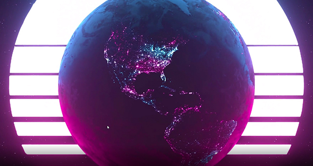
Entering: Miami.
Florida Mayhem reached out to us as they had a very challenging opportunity. They needed a walk out video done for their Homestand event in Miami. We ended up having only 14 days to work on it. For projects like these, you must have a proper strategy & plan in place. Especially if you have multiple stakeholders as we had with our client, the on-site production crew & Activision Blizzard.
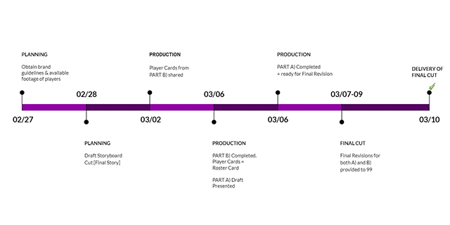
Timeline that we had to stick to if we wanted to deliver the project on time.
The first step after we take on a project is communicating to our clients what we want to do (strategy). We sit down as a team and figure out a concept that we want to go for. We will often times have multiple ideas so we’ll write them all down and put into a presentable form. I always push for 3 options. This is essentially a script, the foundation of the project :.
The script is there for you to look at as you would look at any strategic document for any plans you want to create. It can be your anchor and help you not veer away from where you want to be or a steering wheel which will navigate you in the right direction in evolving your ideas.
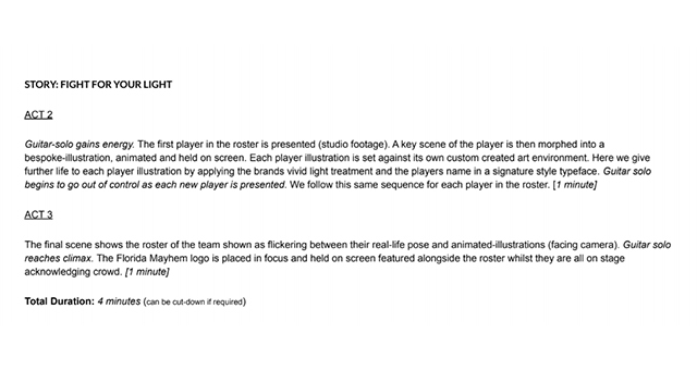
This is how the original script looked like for Part B of the project.
After the script is approved, we work on the mood board & storyboard. The mood board will help you figure out the aesthetics of the piece you are about the create. The storyboard is essentially a breakdown, a structure of the project itself. Together, they form the “how we want to do” part of the project (planning). Ramon, our Overwatch legend, went out of this world and created the perfect storyboard for this piece within just a day.
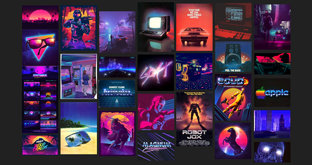
Project mood board.
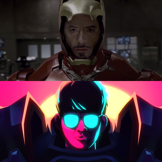
Storyboard example & related scene.
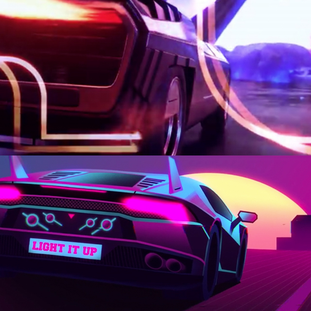
Storyboard example & related scene.
One key thing when setting the structure & later on the pacing of the video is to pick your song early. If the video is a body, the song is it’s skeleton. Initially we suggested a song which featured a very strong electric guitar solo. Sadly, it was too 80s Miami and less of Mayhem so it had to be changed to fit the purpose of the brand.
Now here’s why I loved working on this project so much. This piece was originally supposed to consist out of two parts, Part A & Part B as we called them. We had to find our way around the script as the player footage was impossible to get in such a short time span. We ended up changing Part A completely to not involve players at all and instead build up the hype for the rest of the video, when the players are actually walking out, Part B.
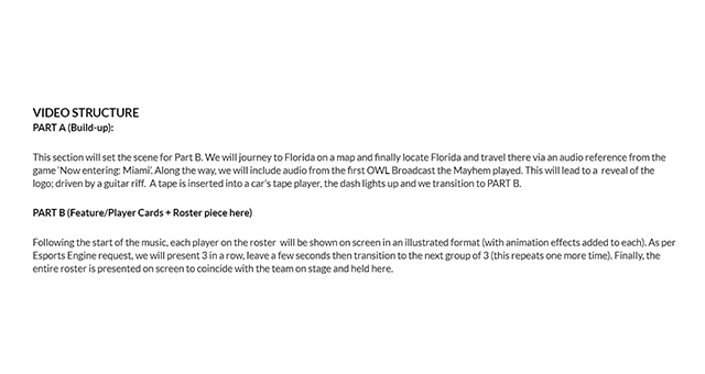
The final video structure.
We wanted to excite the crowd. At this point in time, as you are watching this video live for the very first time, Miami is Earth’s heartbeat. You are a part of that heartbeat. Our art director Mateja and our 3D wizard Jovan created this beautiful piece together. Jovan focused on putting the visuals together while Mata produced the music for the piece, featuring the guitar from the song we picked. It had to slowly build up to the peak of the video, which is very hard to achieve with an electric guitar only.
This piece doesn’t feature the latest version of all the assets in it.
Part B was a bit more straight forward process wise. Through our storyboard, we had already figured out how the majority of the scenes would look like. What happened next was our illustrators grinding through the total of 25 scenes. First they did the sketching, then the line work, coloring and finally, polishing. All we had to do next was animate the scenes.
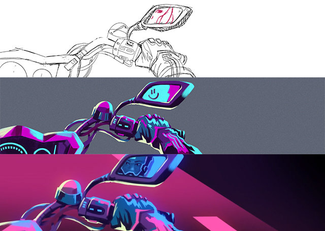
This is how the beginning to end product looks like.
This is our project board showing the progress from sketch to animated scene.
Another heavy part of the project was fitting the scenery to proper resolution, as the OWL screen consists out of 3 panels, only one of them fitting 16:9 resolution. Part A was supposed to be played on the broadcast so it had to be 16:9. With the rest of the shots, they had to be super wide, which made things a bit more challenging.
This was never published. It doesn’t feature the final player cards but it has the majority of the scenes polished out. It features the original song that was supposed to be used.
Thank you for taking the time to read my posts! I am happy to share more things that I've learned and you have interest in. You can subscribe to my email list below, I will be sending weekly updates about my posts. Your email won't be shared anywhere!